Product Summary
The previous digital experience was complex, inconsistent and had hidden options, which prevented users from finding what they needed, specially on their mobile devices. By redesigning the entire digital experience focus on a mobile-first design, users are able to easily find answers on their mobile devices as well as desktop. This has resulted in reduced call volumes alleviating the frustrated users and overwhelmed staff.
Roles & Responsibilities
MY PRIMARY ROLE
UX Designer and UI Designer, creating Information Architecture, Visual Design and Prototypes.
TEAM ENGAGEMENT
Developers, Project Manager, Business Analyst, Online Services, Customer Success Team, Loans Department, MSRs and Marketing.
INTERNAL STAKEHOLDERS
Operations, Sales, Development, Marketing and Executive Teams.
EXTERNAL STAKEHOLDER
Integration partners (OLB hosting), Accessibility partners
The problem & solution
problem
An outdated digital experience focused on desktop design, consisting of poor information architecture and inconsistent UI.
Solution
By redesigning the entire digital experience, reconstructing the AI and content strategy, users are now able to easily find answers on their mobile devices as well as desktop. This has resulted in reduced call volumes alleviating the frustrated users and exhausted staff.
quantitative & qualitative research
Quantitative research Insights
We conducted survey and analyzed data collected over a 2-year time span and created statistical user personas based on those insights.
quaLITATIVE research Insights
To get better insights of our current member’s user experience we conducted user interviews. Below are some of the highlights:
01
Information Architecture
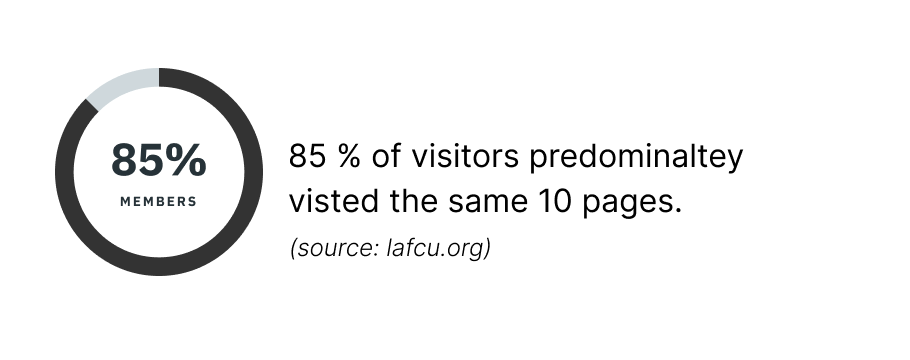
When surveyed an overwhelming majority of users (90%) say they had difficulty finding what they’re looking for.
02
Purpose of Visit
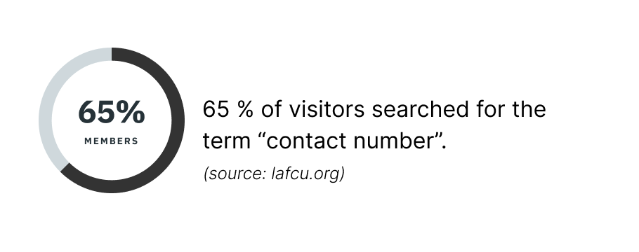
Most of the visitors, Visit lafcu’s website to log into their account. Of those who do not, their main purpose is it to get contact information.
03
Wait Time
A large amount of members were unhappy about the long wait times when calling, resulted in abandoned calls and unsatisfied members.
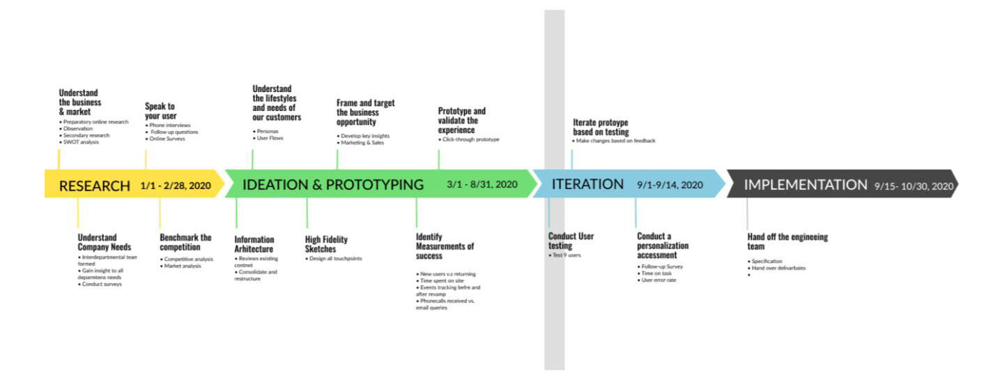
Key Design Changes
Based on the insights from our research, the following are some of the highlighted areas of focus. The scope of this product is very large and not all UX considerations and designs are represented.
Accessible and Inclusive
Accessible and inclusive mobile-first design with advanced search feature helping users find information immediately.
Empowering the user
Reducing cognitive load by display options clearly making it easy for users to make decisions.
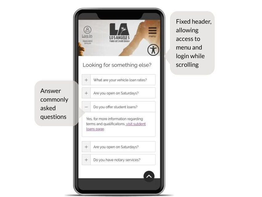
Reduce wait times
Reduce long wait times and decrease call volume by giving users instant answers to commonly asked questions.
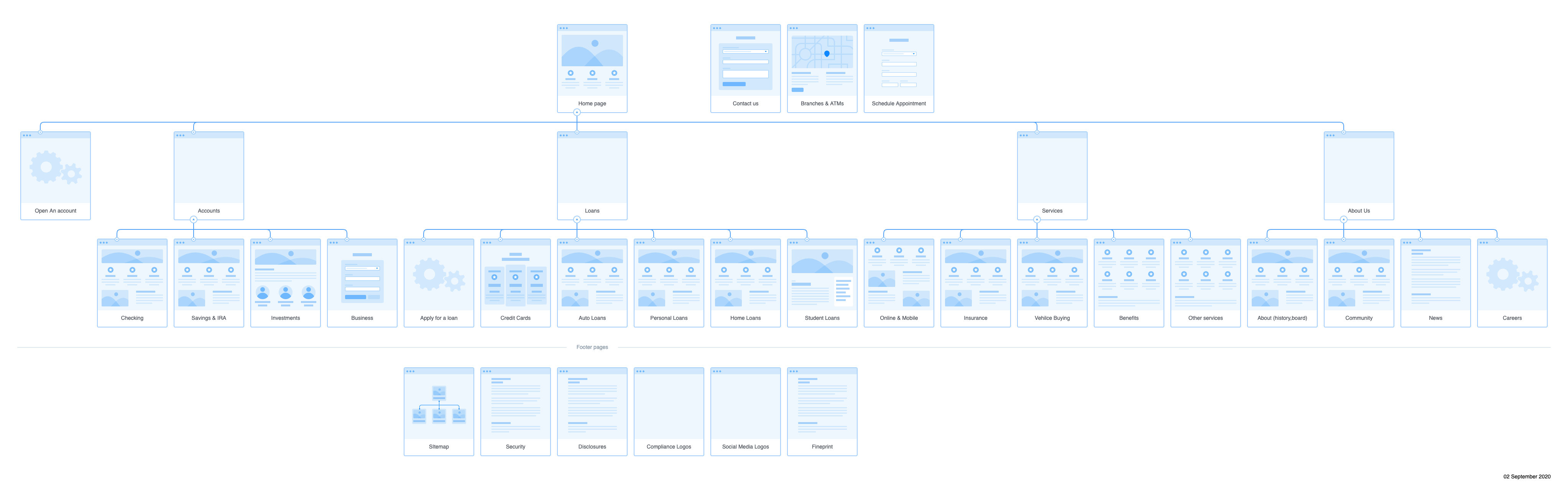
Information Architecture
The goal was to distill complex information architecture into a simple user-friendly solution. The challenge was to consolidate over 100 pages of information into less volume and more concise and mobile friendly content. Starting first with content strategy and establishing four major categories; Account, Loans, Services and About the Credit Union. Secondary objective was to allow users to execute following actions from any page; log-in to their digital banking, search , locate branches/ATMs, make an appointment and being able to contact us.
Design & Iteration
To ensure user has a consistent end-to-end experience and for our team to visualize the product in it’s entire entity, we mapped out the user journeys in Avion. This helped us create and manage user-centric user stories and backlog.
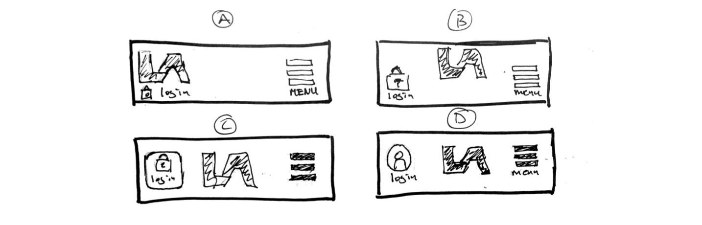
USER INTERFACE – MOBILE HEADERS
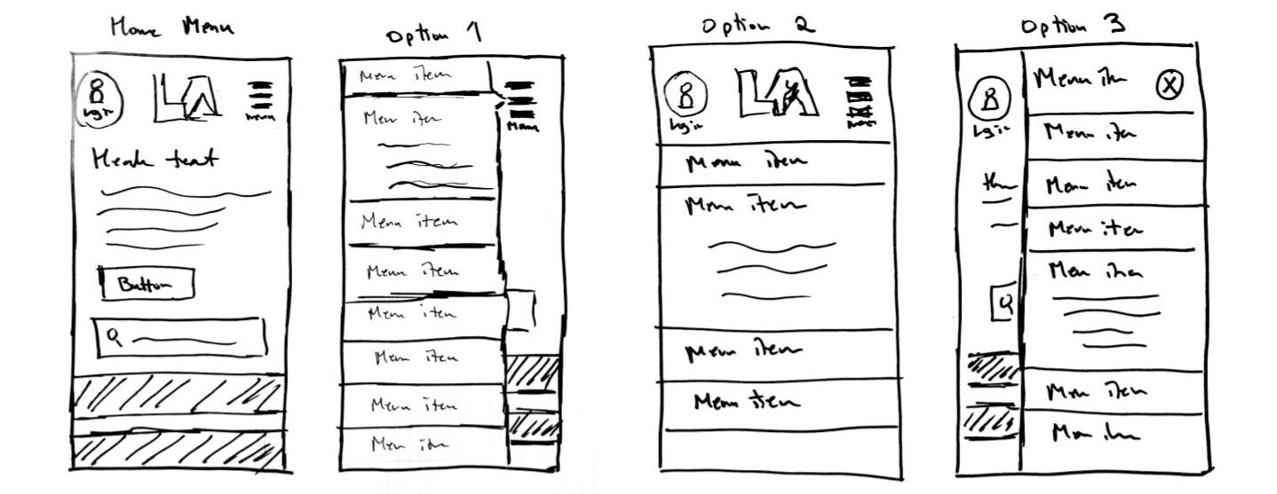
USER INTERFACE – MOBILE MENU
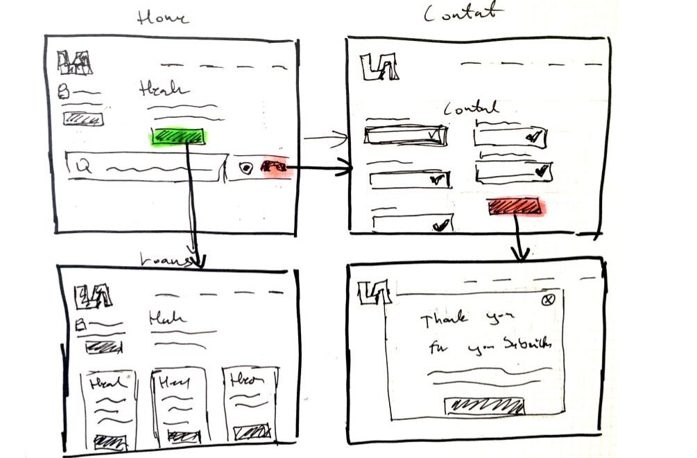
User Flows- Home page
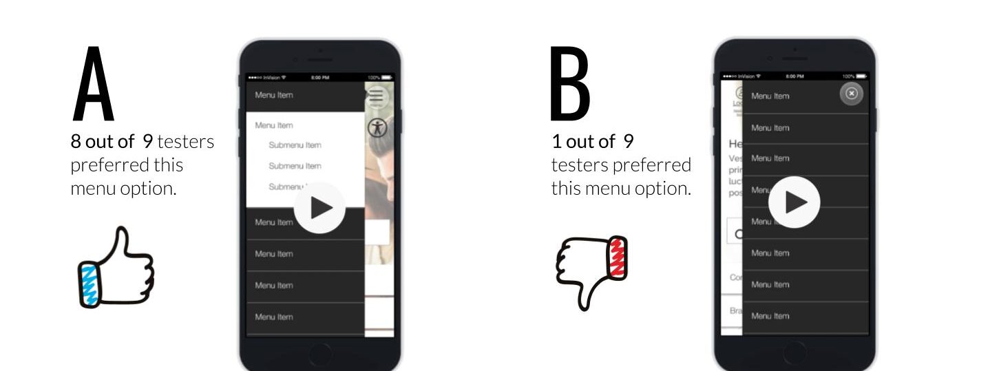
To ensure the user could finish their goal, we created several user flows to help visualize the end-to-end process for each task.
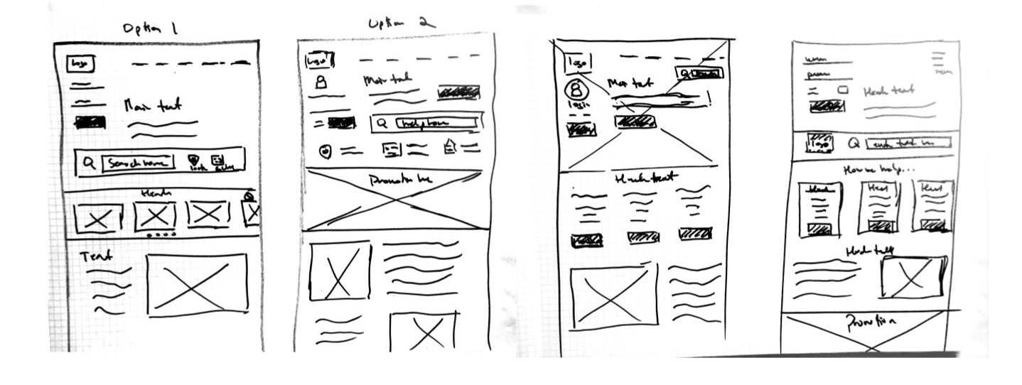
Initial Sketches desktop
To simplify the home page layout and make it easier for users to find information and answers to their questions. The prominence of the search function played a major role in the decision making.
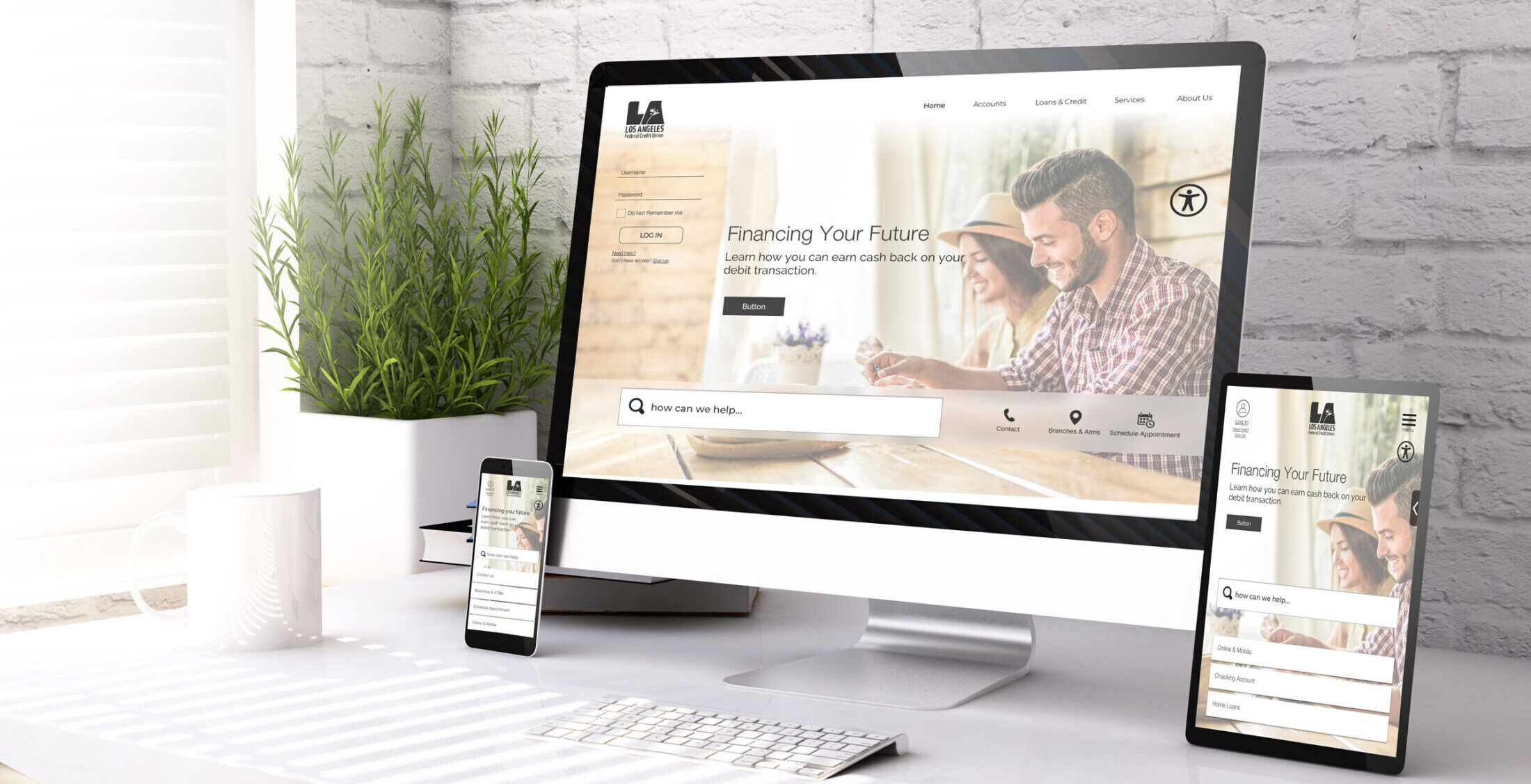
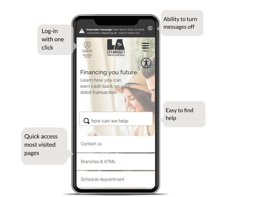
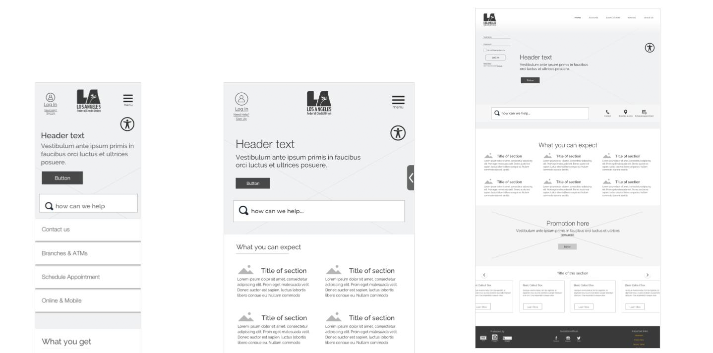
High Fidelity Figma - Home
Accessible clean layout empowering the user. The design is driven by data of most popular pages visited, heatmap to know here users click the most and event click tracking. Based on human centered design, it’s mobile-first but not mobile only. Users can log in to their digital banking and quickly find information they need.
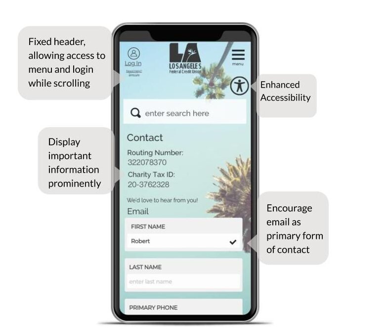
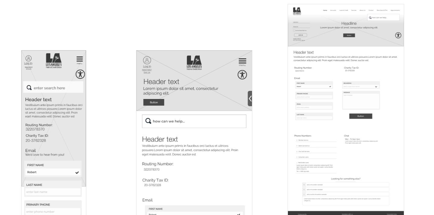
High Fidelity Figma - Contact
Designed to answer most commonly asked questions such as routing number and encourage users to submit queries via email form. Implement SaaS tools to improve member experience to provide answers based on previous user queries.
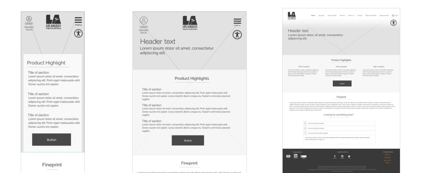
High Fidelity Figma - Feature
This template is predominantly designed to introduce users to new product and/or services. It will be used as a landing page for external advertising including social media and organic search.
Challenges & Lessons Learned
Some of the over arching challenges and what I learned from them:
01
Gain approval from Board and Executive team for the budgeting and resourcing.
Solution
Initial market research was conducted to validate the need in the market, followed by user research to gain the insights to inform of what changes were needed.
02
Understanding and meeting the needs of various departments to ensure alignment with user needs.
Solution
Identified and created a team with key personnel from each essential department (including real estate loans, vehicle loans, membership services, customer service, financial services, visa marketing etc.) to understand their paint points.
03
Finding the right partner and outsourcing development work.
Solution
Once initial scope of work was determined, I researched and interviewed a few providers for development and QA. Worked closely with chosen 3rd party vendor at early phase of the project to get their buy-in and ensure feasibility.
04
Managing all aspect of the UX process, including research visual design, information architecture as well as managing the project.
Solution
Developed internal processes to ensure we kept track of the project. Enlisted the help of other team members to help with Copy and image sourcing.
Product Outlook
Due to the pandemic, some priorities changed and we were not able to scope the project out fully while I was working there. However I was able to hand off the artifacts to engineers to go live.