Toggle navigation
Home
Product Design
About Me
Case Studies
Service Design
TV App – Voice assisted
Web Design
Shopify Ecommerce BH Florist
WordPress CMS Equinox Arch
WordPress CMS Masropian CPA
Contact
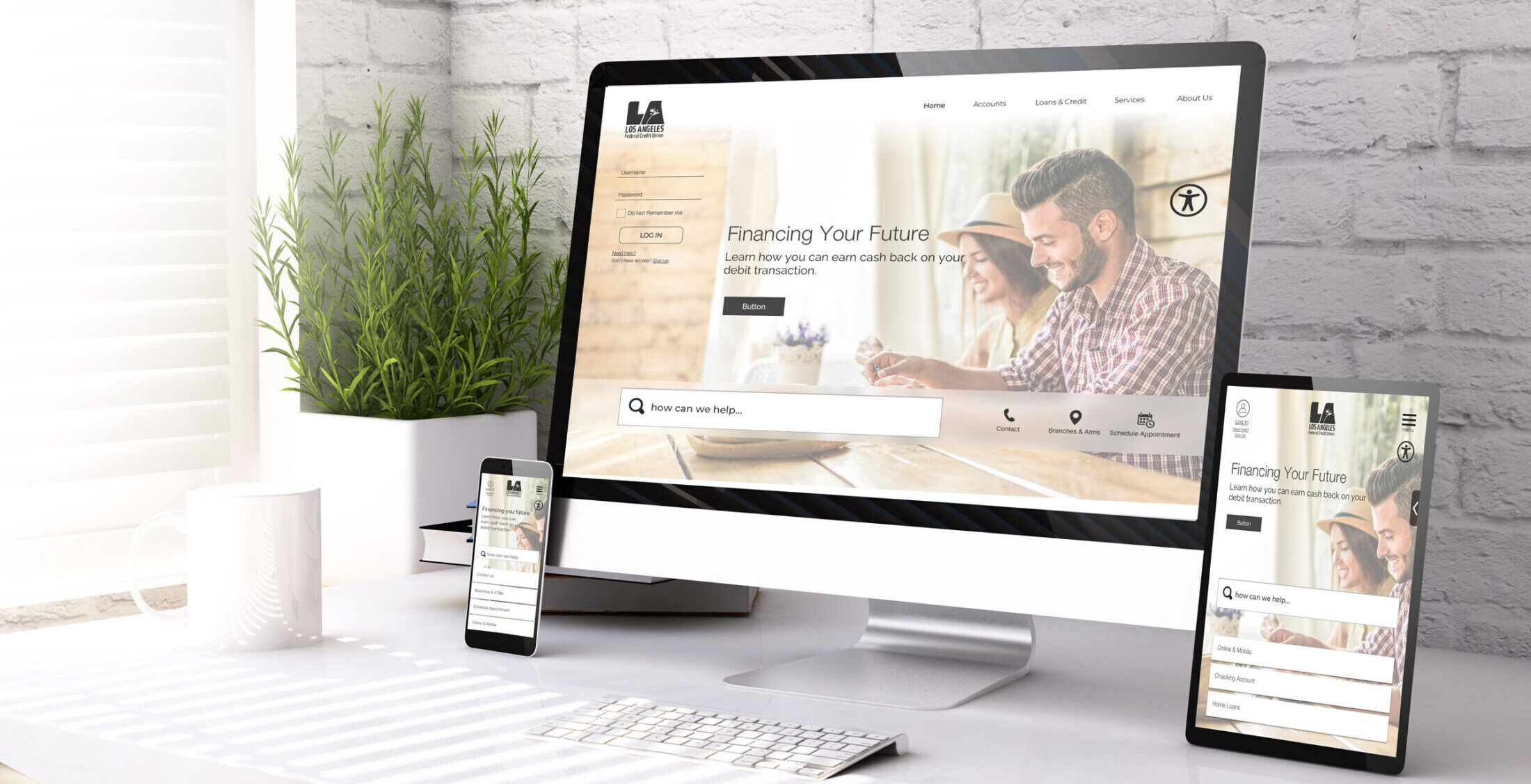
Protected: Los Angeles Federal Credit Union
This content is password protected. To view it please enter your password below:
Related Projects
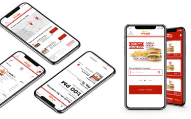
Protected: IN-N- OUT SERVICE DESIGN
Protected: Airbnb
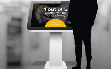
Protected: LA Food Bank – Experience Design
Next Project
Previous Project
